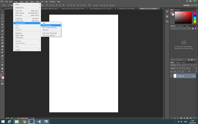
These are the screenshots I took when creating my pop art final image and here I will explain what tools I used to create my piece and what I did to make it perfect.

First I created an A4 page to start off and then I went on to images>image rotation> 90 degrees clockwise to turn it on its side.
After I created a blank page and turned it clockwise, I went online and got an image of a gritty texture which I wanted to use to give it a better effect.
Before I added my object to the main page, I had it on a separate page so I can edit the object making it have a better effect. To do this I went on to the curves tool and changed the shadow and brightness on the image and then I made sure that the background was really white which helped me to create my final image.
Then I added the edited skittles image on to the main page and made sure when I add another image to the page what the object will not cover the gritty texture so I selected multiply on the skittles image which make the gritty texture go in front of the object without blocking it.
I felt like the gritty texture was too much so I went on to the levels tool and changed the contrast on the image making the texture darker to make it stand out more and also increasing the brightness so the texture dissolves on the corner.
Before finishing the image I flattened it so all the layers would join as one. Then I copied the image and pasted on to the new page.
Over here is the new page I started to create, making sure the resolution was 150 pixels and then I pasted the edited object with the gritty texture.
When that was done I pressed alt and dragged the image to make another copy to start making my pop art image.
To make my image look like a real Pop-Art image I pressed Ctrl+U to open up the Contrast/Saturation tab.
By using the Contrast/Saturation tab I could change the colour of my object on each box by moving the Hue, Saturation, and Lightness bars so I made each one a different colour.
To make it easier I added a green background over the skittles and then changed all the colours on each object so the background would also be a different colour.
After all that, I finished my final image and then printed it out as an A3 page which turned out well as it looked like a nice Pop-Art image.


No comments:
Post a Comment