Pop-Art Evaluation
For this project we were asked to create a Pop-Art image using any object we would like to create our image using Adobe Photoshop CC while various different tools and skills we learned throughout the year to create our final piece.
My idea was to create an image using one of the props I shot images and I decided to use a Skittles packet as my main object and then edited the prop while following the theme. Although I was not sure where to start, at the end I managed to create a great piece by following a tutorial on YouTube which showed me how to create my Pop-Art image.
Here is the link: https://www.youtube.com/watch?v=4nPOF91gwEE&feature=youtu.be
Following this tutorial I learned a lot of new skills which was part of my secondary research but I didn't follow the whole tutorial as I used some skills I already learned from our previous lessons and also followed the skills I learned from reading about Pop-Art images online and how it first started and also what makes it so popular which was part of my primary research.
http://www.artmovements.co.uk/popart.htm
This is one of the websites I went on to find out information about the history of pop art and why it is so well known as Andy Warhol brought Pop Art to the public eye as he used simple everyday objects such as Coke bottles, soup tins, and film stars to get attention from everyone which is how I found out how you can make a simple object into an amazing piece of art work.
To make sure I set up my space properly for the day of the shooting, I drew an image of how I will set up and also what props I will use to set it up.
Before I started my piece, I made a list of items I was going to take to shoot images of using a Lumix camera and the objects were- Cans of drinks, a skittles packet, a Frijj milkshake bottle, headphones, and an mp3 player. Although I was only going to choose 1 object in the end, I still shot some images of all of these objects to make sure I get the right one so I can be satisfied with my work in the end.
Here are my test shots I did to show that I learned what kind of mistakes I have made and why I did not use these images for my final piece. Even thought all the other items would be great to use, I decided to settle for the skittles packet as this has bright colours on it which stood out when the colours were changed when editing.
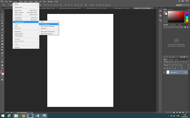
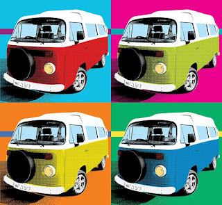
Throughout the making of this Pop Art image, I used a range of tools to make it the way it is. To start off I opened up a blank page and added a grainy background as I found one online. Then I added my skittles image and adjusted the contrast and brightness on the image by using the curves tool to make the image stand out more. Then I multiplied the image so the skittles would be behind the grainy background and then changed the brightness and contrast on it so it also stands out more and to make it fade a little bit. Then I added a bright green background to the skittles image to begin make it look like a Pop-Art image. After I did all that I opened another new page and added the whole image on it and pressed Alt and dragged the image to make three more copies of the same image and then pressed Ctrl+U to change all the colours on each of the skittles images making it look like a Pop-Art image.
After I finished my whole piece, I went to print in out in an A3 size and also printed out my Proposal and test shots so I can glue them on a big piece of black paper which I used to present my work so when the level 3 Photography Tutor came in our lesson, he could see all my work in one area. The reason he came and had a look at all our work was to choose a 3rd, 2nd, and 1st place from our whole class as he looked at how we created our work and how it ended up in the end and what kind of research we did. Although all of the other student work were amazing, I ended up in 1st place for my creation as my work was unique and he liked that the grainy bits in the corner stood out with the whole image.
Feedback from Dan- I think that her work is great! She's really managed to capture the Pop Art theme, I like the grainy effect in the background and I think that using Skittles for her product is pretty fun. She could have duplicated the images so that there were six of them instead of four, but apart from that, Well Done!! :)
What I think went well was that I chose a great object to use as the skittles already have a red bright bold colour on it which I can change and make them look even better with different bold colours by pressing Ctrl+U. What I could improve would be to make 6 images of the skittles in different colours rather than 4 as Dan said when he gave me some feedback which I agree on. But other than that I think I did well with all my editing especially with the grainy background which was unique from the other student work which is what I would keep the same if I could change it.


